An accessible food-delivery app built for people new to digital platforms
This project explored how food-delivery apps can better serve users who feel anxious or overwhelmed by modern digital interfaces. The goal was to design a calm, predictable ordering experience for newcomers to technology—one that reduces friction, cognitive load, and decision pressure from the moment the app opens.
Many existing delivery apps rely on dense layouts, aggressive promotions, and complex filtering systems. For less tech-confident users, these patterns create uncertainty around navigation, ordering steps, and checkout—often preventing users from completing an order at all.
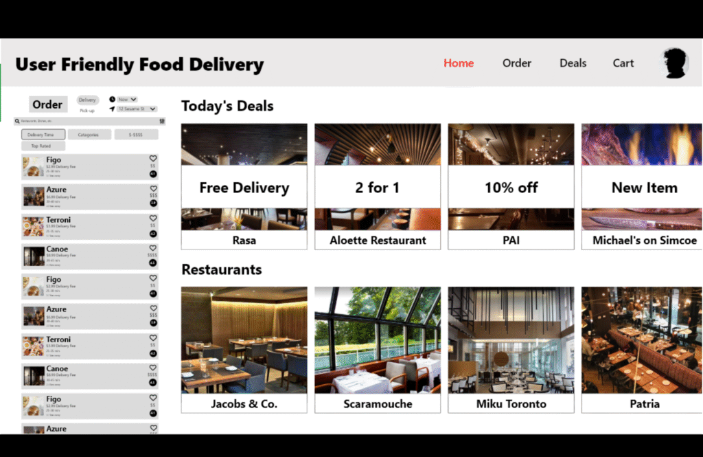
I focused on simplifying the experience from end to end. The app uses a clear, mobile-first layout with a predictable top-level navigation (Home, Order, Deals, Cart) and consistent visual patterns across screens. Filters were rewritten in plain language and reduced to essential options, while promotions were grouped into clearly labeled sections like “Today’s Deals” to avoid visual noise.
Accessibility was built into every decision: large tap targets, readable type, strong contrast, and clear button labels. The checkout flow was consolidated to minimize steps, with supportive empty and error states that guide users forward rather than penalize mistakes.
Through iterative prototyping and testing, the design reinforced a simple mental model—browse, choose, review, confirm—making the experience feel approachable rather than intimidating.
Outcome
A clear, inclusive food-delivery experience that allows first-time and low-confidence users to complete orders independently, supported by a reusable UI system designed for consistency and ease of use.